The challenge
The challenge was creating a mark that communicated leadership, focus, and forward momentum—without relying on the usual abstract symbols or safe corporate tropes that make consulting brands forgettable.
The approach
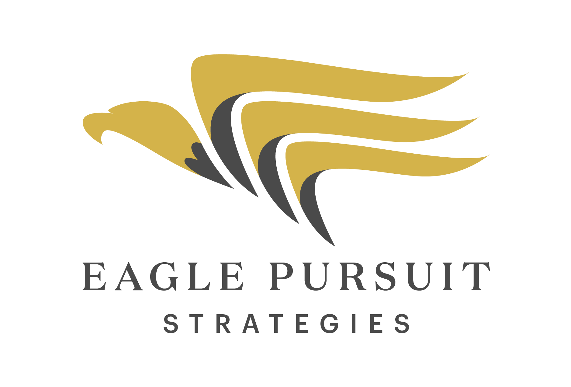
Rather than over-designing the solution, I focused on clarity and symbolism. The eagle was chosen as a direct representation of vision and pursuit—but treated with restraint so it felt intentional instead of decorative.
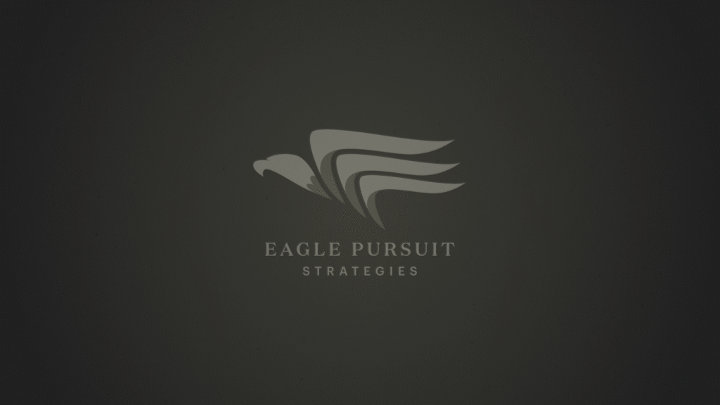
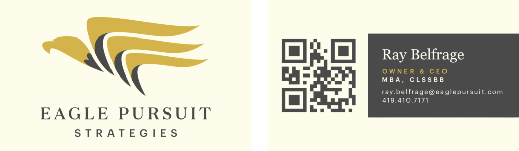
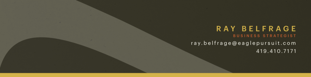
The mark balances strength and simplicity, allowing it to function across digital, print, and presentation contexts without losing impact.
Typography
Typography was selected collaboratively to align with the client’s preferences for a more traditional, professional tone. This ensured the identity felt credible to their audience while allowing the mark itself to carry the visual character.
Outcome
This project is an example of applying restraint where it matters. Not every brand needs to shout—but even conservative industries benefit from a clear, confident visual anchor that separates them from the noise.